




Printed water activated tape lives or dies on the artwork. The same print method and the same tape can produce a crisp, confident seal or a muddy, mis-registered one, and the difference is almost always in how the file was set up. This guide covers the design decisions: the repeat, coverage, colour, legibility, file prep, proofing, and the print problems that show up when those are wrong.
For the commercial side (which method, minimum order, cost) see custom water activated tape; for the brand-strategy side see branded water activated tape.
Key points
- Design for the repeat: a customer sees only about one full repeat per carton face, so spacing and placement matter as much as the logo.
- Pick a coverage level deliberately: line art, spot colour, heavy coverage or full bleed each have cost and print-quality trade-offs.
- Work in the right colour space and give a Pantone reference for anything that must match. Kraft shifts colour; white prints truest.
- Supply vector art, mind the bleed and safe margins, and design to the printable width.
- Always sign off a physical printed sample if colour or fine detail matters.
Design for the repeat, not the logo
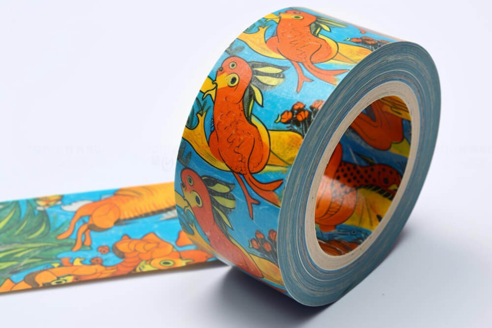
Printed tape is a continuous roll with your artwork repeating along its length. On a sealed carton, the customer sees roughly one repeat across the top and a bit more down each side. So the unit of design is the repeat, not the logo on its own.
- Spacing. Generous space between repeats reads as more premium and stays legible. Cramming repeats together looks busy and cheap.
- Orientation. The artwork should read correctly whichever way the carton is turned. Avoid designs that only make sense one way up.
- Partial repeats. Assume the tear-strip, a label or a fold will cut through a repeat somewhere. Make sure a half-visible repeat still shows the brand, not a random fragment.
- Repeat length. Ask the printer for the exact repeat length their plate or digital setup produces, and lay the artwork out to that, so the spacing you designed is the spacing you get.
Choose a coverage level deliberately
Line art / single spot colour, low coverage. A logo or wordmark in one colour on natural or white tape. Cheapest, fastest, most forgiving, ages well. The default for most brands.
Two spot colours. A logo plus an accent or a keyline. Still clean, modest cost increase, one extra plate on flexo.
Heavy coverage (over ~50% ink). A strong brand-colour field with reversed-out type. High impact in photos and on the shelf. Printers usually add a thin protective varnish above this coverage so the ink does not rub in transit; confirm the varnish is water-based so the tape stays recyclable.
Full bleed / edge-to-edge. Artwork runs off both edges of the tape with no unprinted margin. Best done digitally (no plate limits on colour). Most expensive per metre; check the printer can genuinely bleed to the edge rather than leaving a thin unprinted strip.
A common way to get the full-coverage look for less: print a lighter background colour with a darker logo, instead of a true dense ink field.
Colour
- Colour space. Design in CMYK for digital print. Give a Pantone (PMS) reference for any brand colour that has to be exact; screen RGB will shift in print.
- Kraft vs white stock. On natural kraft, inks sit down and warm up; light colours can look muddy and pale colours can disappear. On white tape, colour is truer and type is crisper. If your brand hinges on a specific colour, specify white.
- Ink is translucent on kraft. A brand colour printed on brown will not match the same colour on white. If you run tape on both stocks, expect and approve two slightly different results.
- Registration tolerance. Flexo can drift a fraction between colours. Avoid designs where two colours must line up perfectly along a thin edge; build in a small overlap (trap).
Legibility: the belt test
The tape is seen in motion, often upside down, sometimes half-covered. Before you approve artwork, check it passes a quick “belt test”:
- Can you read the brand at a glance as a carton goes past?
- Is it still recognisable upside down and at an angle?
- Does it survive a label or the tear-strip covering part of it?
- Is the smallest text still legible at arm’s length? Set body text larger than you think; fine print vanishes on tape.
- Is there enough contrast between ink and stock? Pale ink on kraft is the classic mistake.
Artwork file prep
- Vector for logos, wordmarks and type (AI, EPS or PDF with outlined fonts). Raster images at 300 dpi at final printed size.
- Printable width. Design to the tape’s printable width (commonly 70 to 72 mm) minus any unprintable edge the printer specifies.
- Bleed and safe margin. Extend any element that should reach the edge a few millimetres past it (bleed). Keep logos and text a few millimetres inside the edge (safe margin), because tape can drift slightly during printing and application.
- One repeat, clearly marked. Supply a single clean repeat tile with the repeat length noted, not a long pre-tiled strip, unless the printer asks otherwise.
- Spot colours named. Label Pantone swatches by their PMS number in the file, and remove unused swatches.
The proof process
- Digital proof. The printer sends a PDF or on-screen proof of the layout and repeat. Check spacing, orientation, spelling, colour build and safe margins.
- Printed sample. For any job where colour or fine detail matters, ask for a physical printed sample on the actual stock before the full run. Screen and paper never match exactly, and kraft especially surprises people.
- Sign-off. Approve in writing. Note the Pantone references, the stock, the coverage and the varnish on the approval so a reorder reproduces the same result.
- Archive. Keep the approved artwork, the proof and the plate or setup details together, so the next run is a repeat rather than a redesign.
Common print problems and how to avoid them
- Muddy or washed-out colour: wrong stock for the colour. Move to white tape, or choose a colour that works on kraft.
- Mis-registration (colours not aligned): too tight a design for flexo tolerance. Add trap, or simplify to one colour, or print digitally.
- Ink rub in transit: heavy coverage with no varnish. Add a water-based protective varnish.
- Logo cut awkwardly by the tear-strip: repeat not laid out to the printer’s repeat length, or the tear-strip position not accounted for. Get both dimensions from the printer first.
- Type illegible on the carton: set too small, or too low-contrast. Enlarge, increase contrast, retest with the belt test.
- Colour drift between orders: no Pantone reference or approved sample on file. Always record and re-supply them.
How Carewell Group fits: artwork to finished roll
Carewell Group is an Australian packaging manufacturer and supplier. We design custom packaging around your product, add your branding and print, and supply the whole dispatch line from one place, so printed tape is handled from artwork setup to a roll on your bench.
- Printed water activated tape, flexographic or digital, on natural or white kraft, reinforced or non-reinforced, in water-based inks so the carton stays recyclable.
- Artwork help: we will lay your design out to the correct repeat, flag legibility and registration risks, and proof it before the run.
- The commercial detail (method, minimums, lead time) is in the custom water activated tape guide; the brand-strategy side is its own guide.
- The rest of the parcel to match: kraft paper mailers, honeycomb mailers, kraft cartons and paper void fill.
- Custom design and engineering. If your product needs a specific carton, insert or seal, we build it to fit rather than making you adapt to stock sizes. From engineering to finished, ready-to-use packaging, your business gets a solution, not another task.
- Browse the water activated tape range or the full custom water activated tape service.
Carewell operates from NSW with warehousing in Smithfield, Matraville and Padstow, works with clients across grocery and retail, e-commerce, food and beverage, and industrial and manufacturing, and is certified to ISO 9001:2015, ISO 14001:2015 and ISO 45001:2018, and an APCO member.
Have artwork to print? Request a quote and samples or call +61 (02) 8760 1491.
Frequently asked questions
What file format should I supply for printed water activated tape?
Vector art (AI, EPS, or PDF with outlined fonts) for logos and type; raster images at 300 dpi at final size. Design to the tape’s printable width and include bleed and a safe margin.
Why does my brand colour look wrong on kraft tape?
Ink is translucent, so on brown kraft a colour warms and darkens and light colours can disappear. Print on white tape for accurate colour, or choose a colour that holds up on kraft, and always approve a printed sample.
How many print colours can I have?
Flexographic print is usually one to three spot colours. Digital print has effectively no colour limit and can do gradients and photographic detail, at a higher per-metre cost.
Do I need a varnish on printed tape?
For heavy ink coverage (roughly over 50%), yes, to stop the ink rubbing in transit. Use a water-based varnish so the tape stays recyclable.
How do I stop the design being cut awkwardly on the carton?
Lay the artwork out to the printer’s exact repeat length and account for the tear-strip position, and make sure a partial repeat still shows the brand rather than a random fragment.
Sources
- Holland Manufacturing and Globe Guard Products, custom printed water activated tape (ink coverage, top-coat varnish, kraft vs white, design approaches): hollandmfg.com
- Print artwork guidance: CMYK / Pantone matching, resolution, bleed and safe margins, full-bleed design
- Australian Packaging Covenant Organisation (APCO): apco.org.au
Written by Alif Vasaya, digital and content strategy, Carewell Group. Carewell Group is an Australian packaging, food packaging, tape, industrial safety and 3PL supplier. Last updated 10 September 2026.